(-) objective
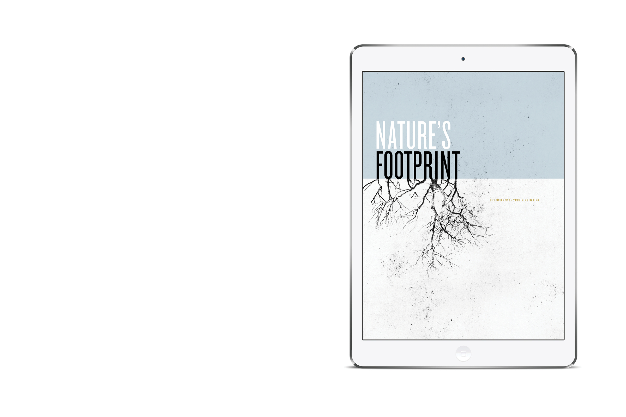
An iPad brochure was created around the chosen topic of Dendochronology, or the study of tree-ring growth patterns as a method of scientific dating. The goal was to explore the ways in which typography itself can tell it’s own story both in its physical appearance and representation, as well as in a figurative manner.
(+) concept
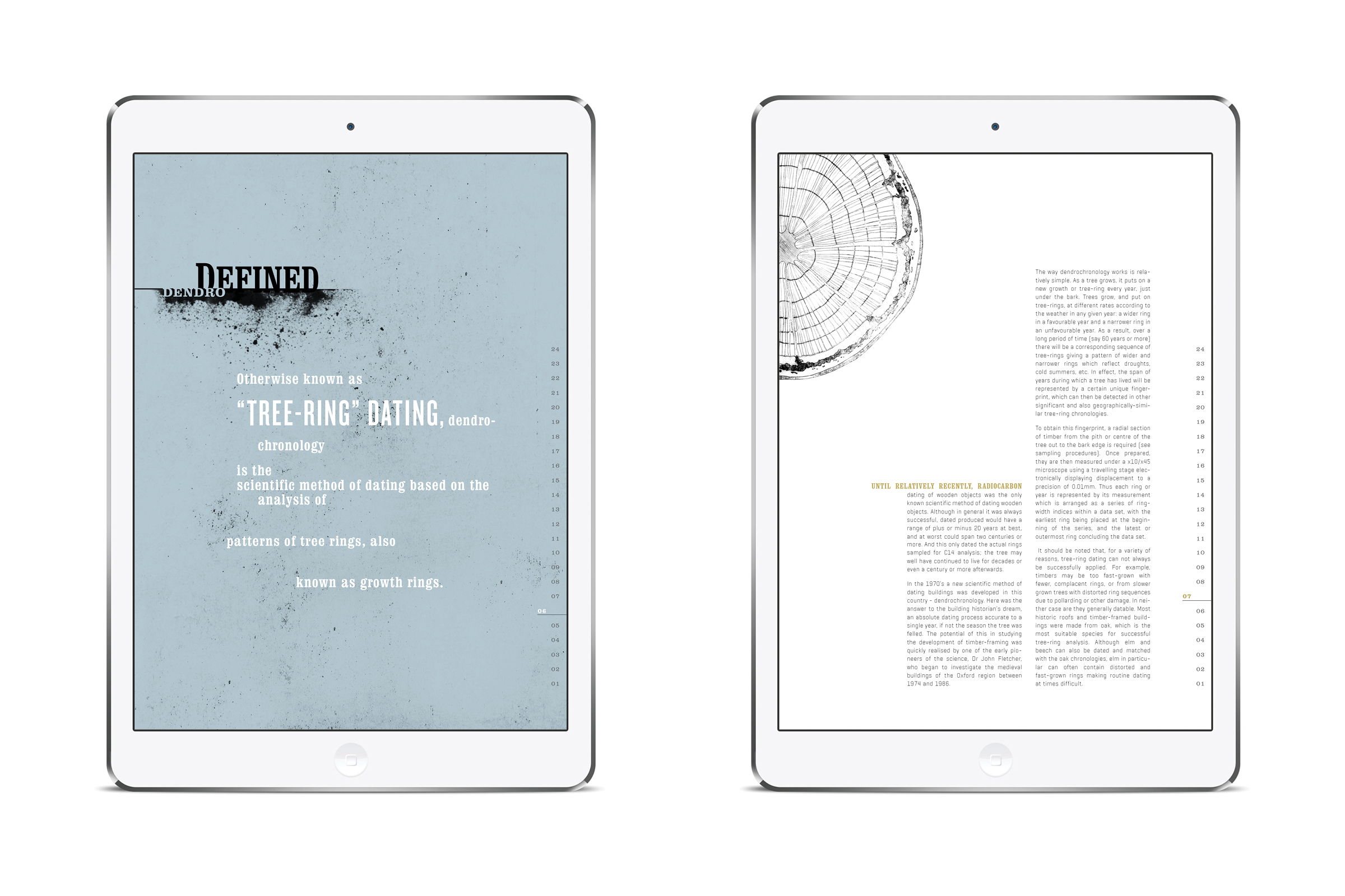
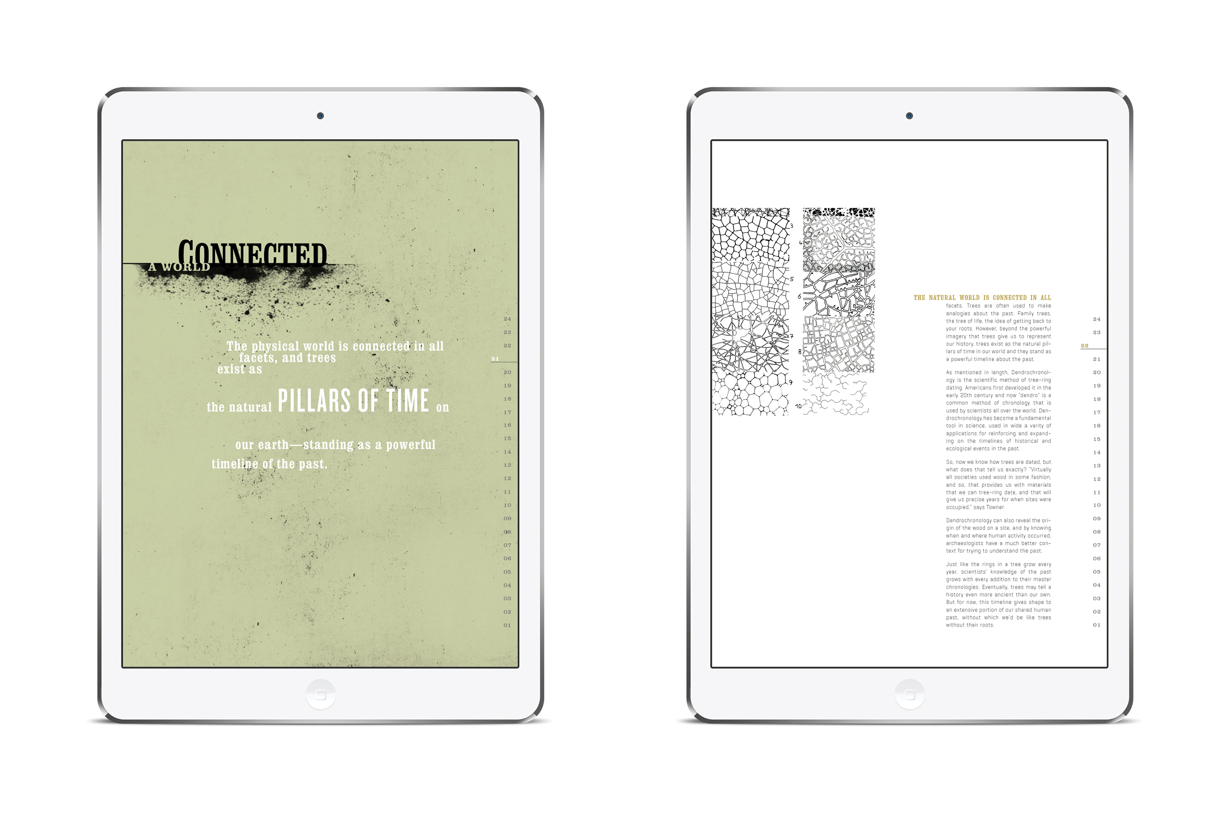
The paradoxical combination of bold wood type and a clean geometric san-serif type were chosen to represent the contrasting relationship between science and nature. Tall vertical columns of body text, varying in height, were utilized to mimic the physical properties of trees.
(=) design
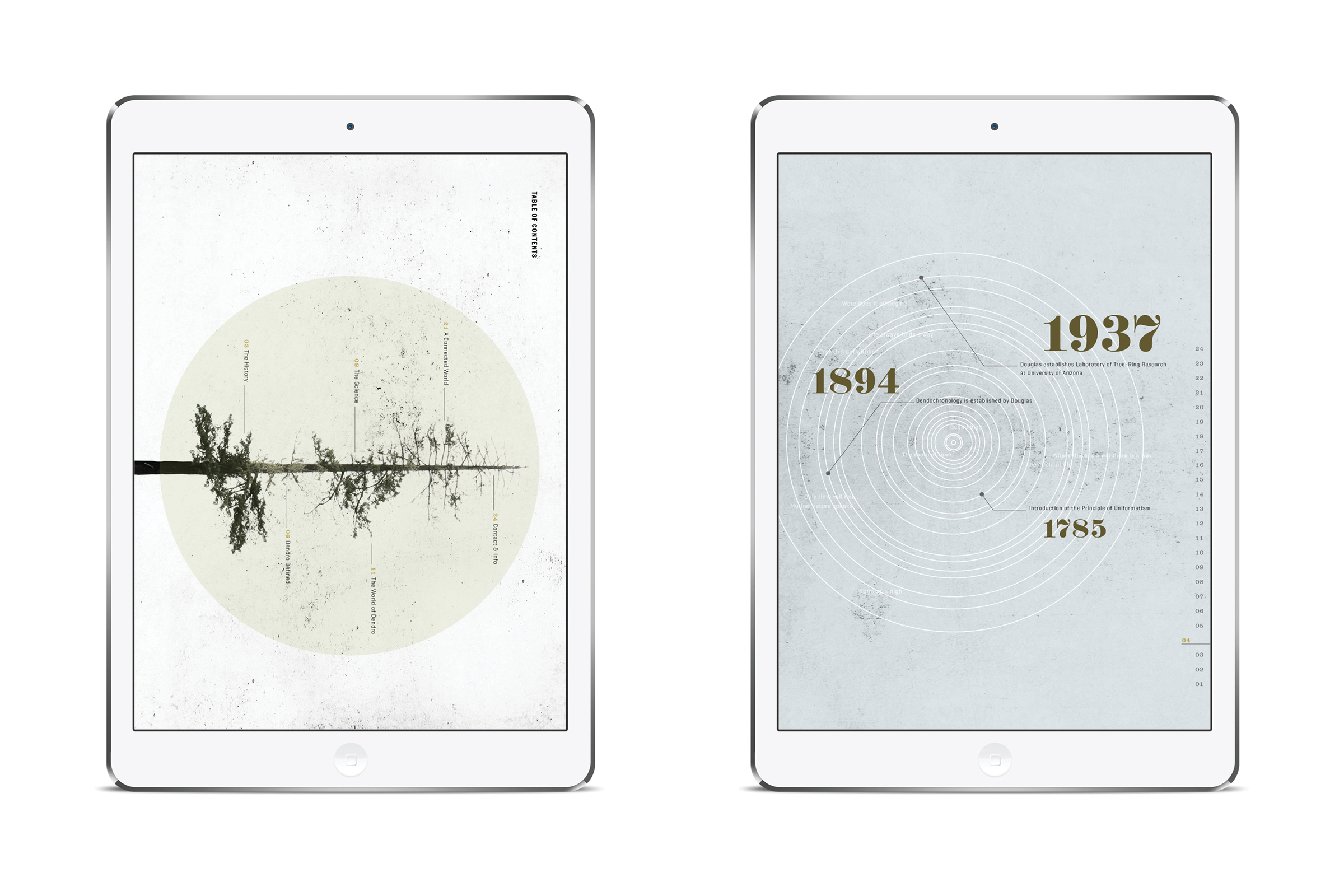
Other more subtle treatments in layout and type were also used, such as a stacked vertical page numbering system, to simulate the counting of tree-rings themselves. Nonsensically set type was used to mirror the unpredictability of nature. In addition, the playful and purposeful interaction of type and imagery was applied to relate to the subject matter.


