(-) OBJECTIVE
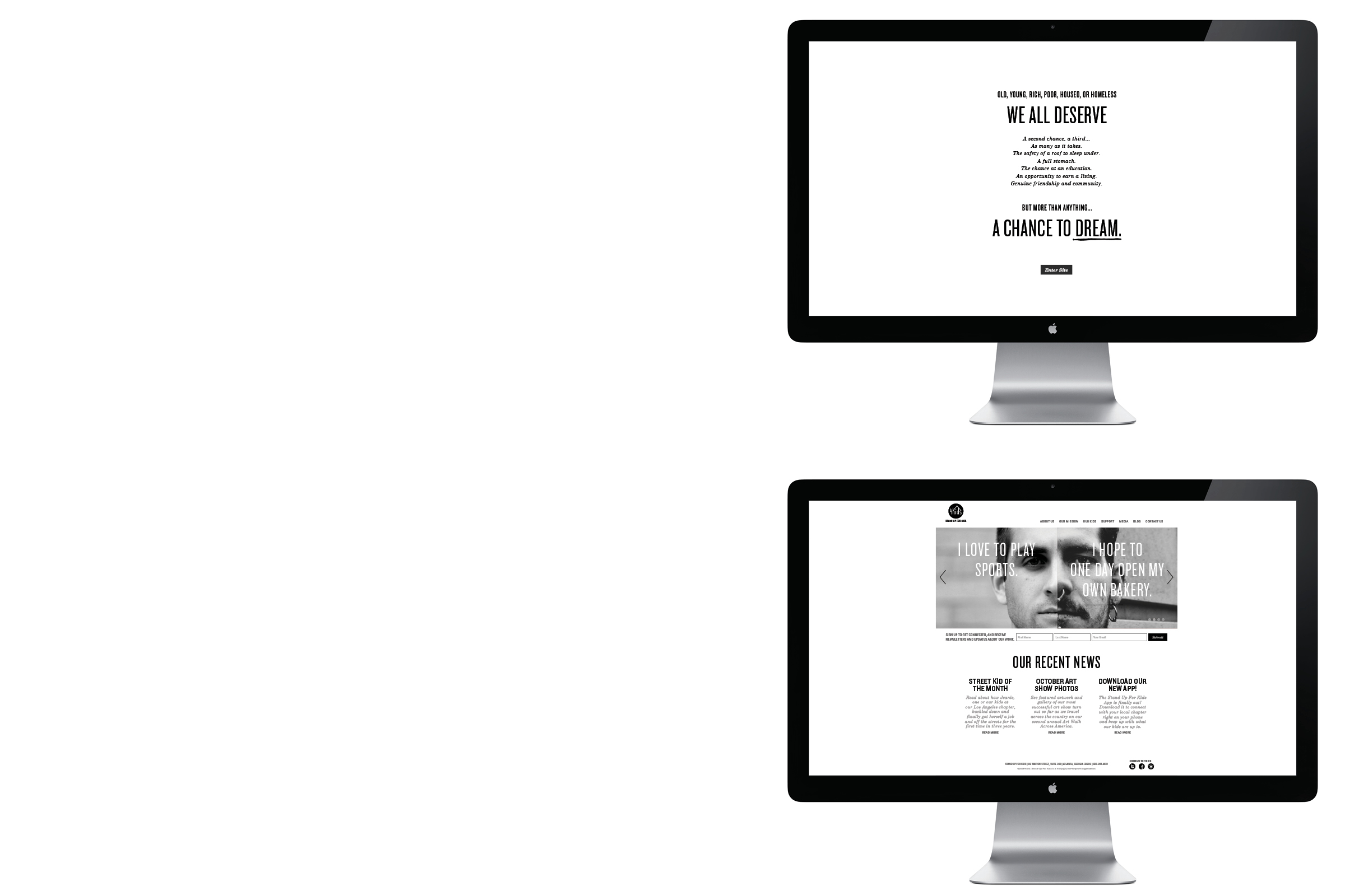
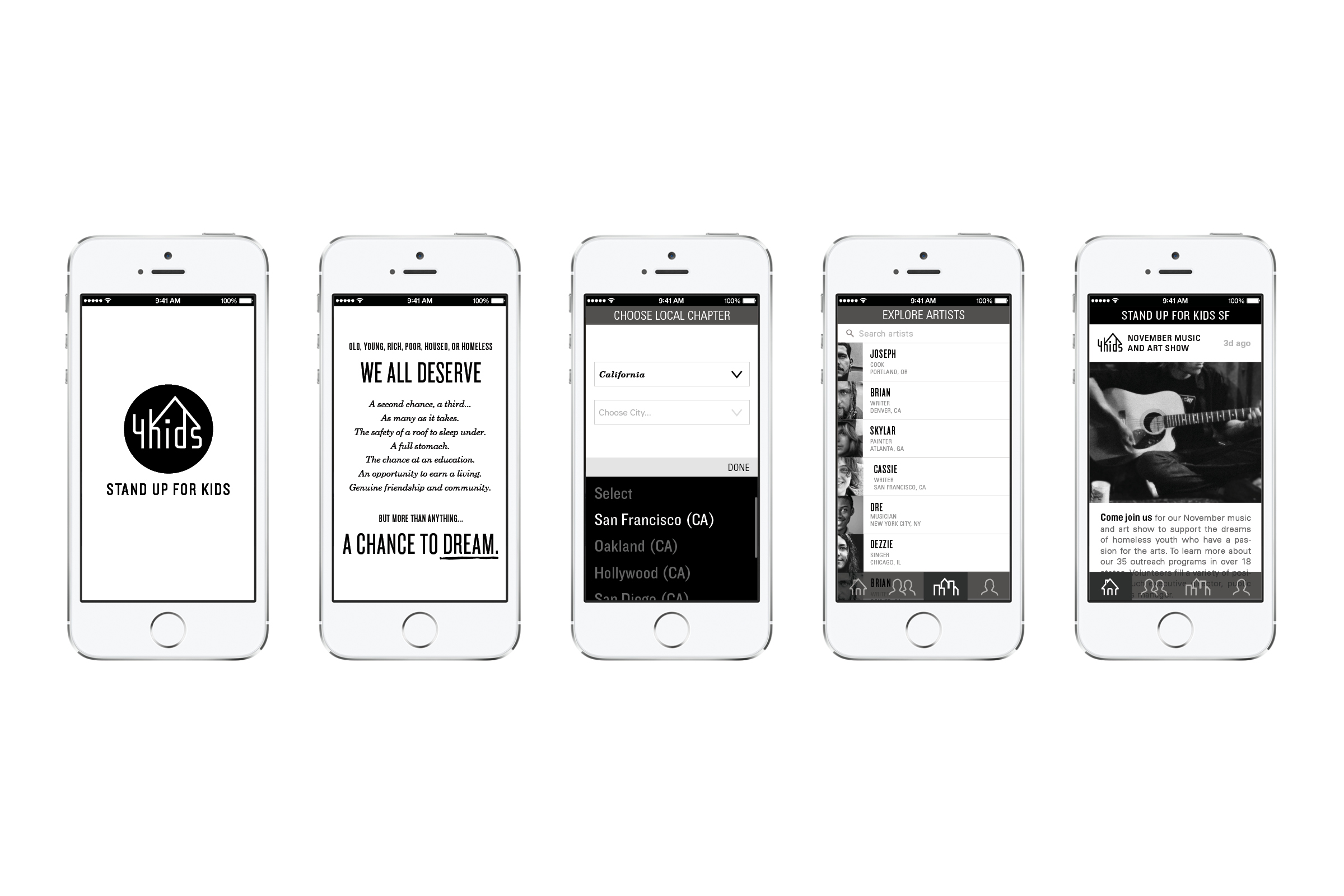
This was a semester-wide project in which the scope was to choose an existing non-profit organization to then develop an entirely new brand and identity system for. The organization chosen for the project was Stand Up For Kids, a non-profit that aims to support homeless and at-risk youth and equip them with resources that will help get them off the streets in pursuit of a more fruitful life.
(+) CONCEPT
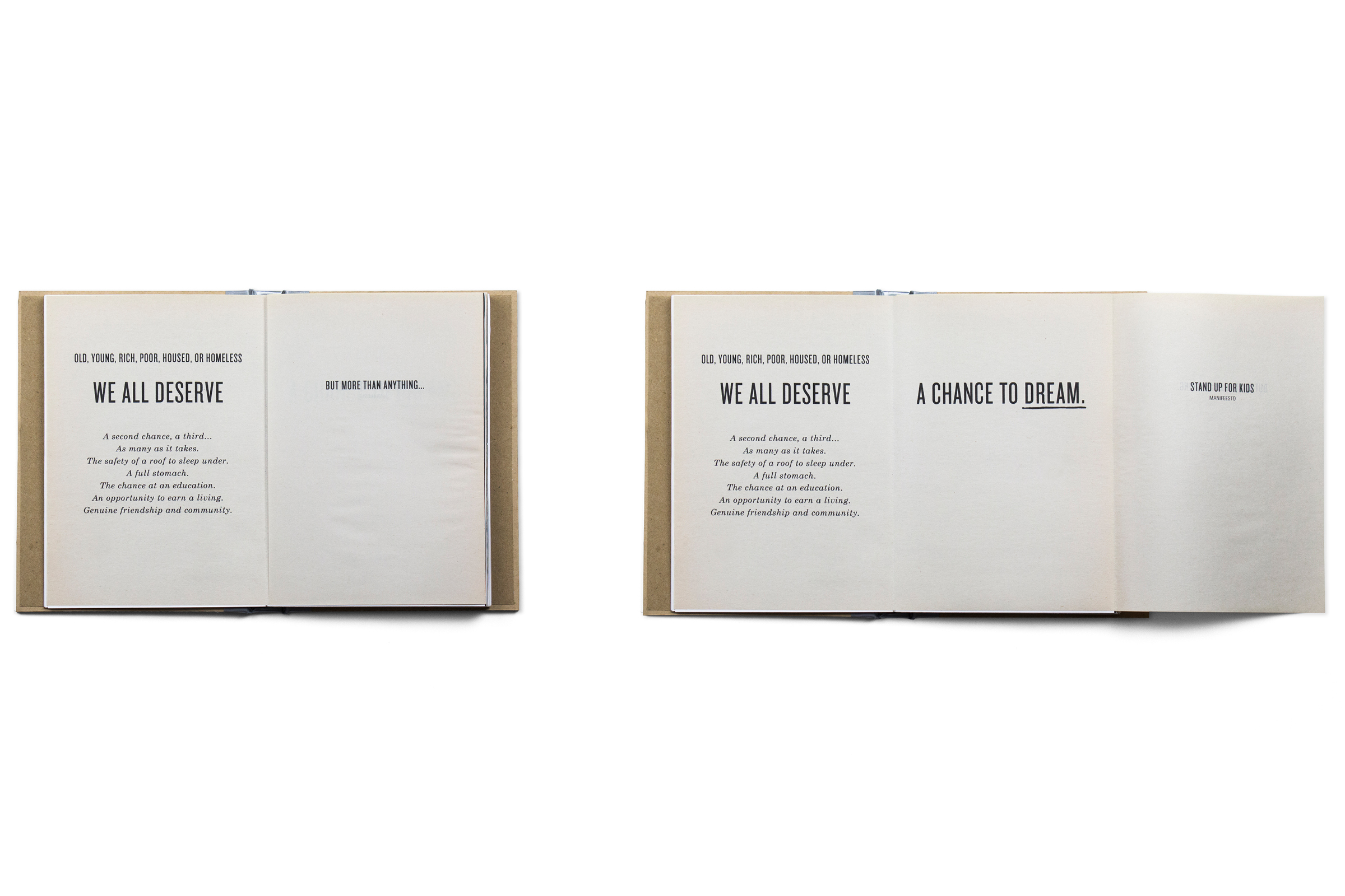
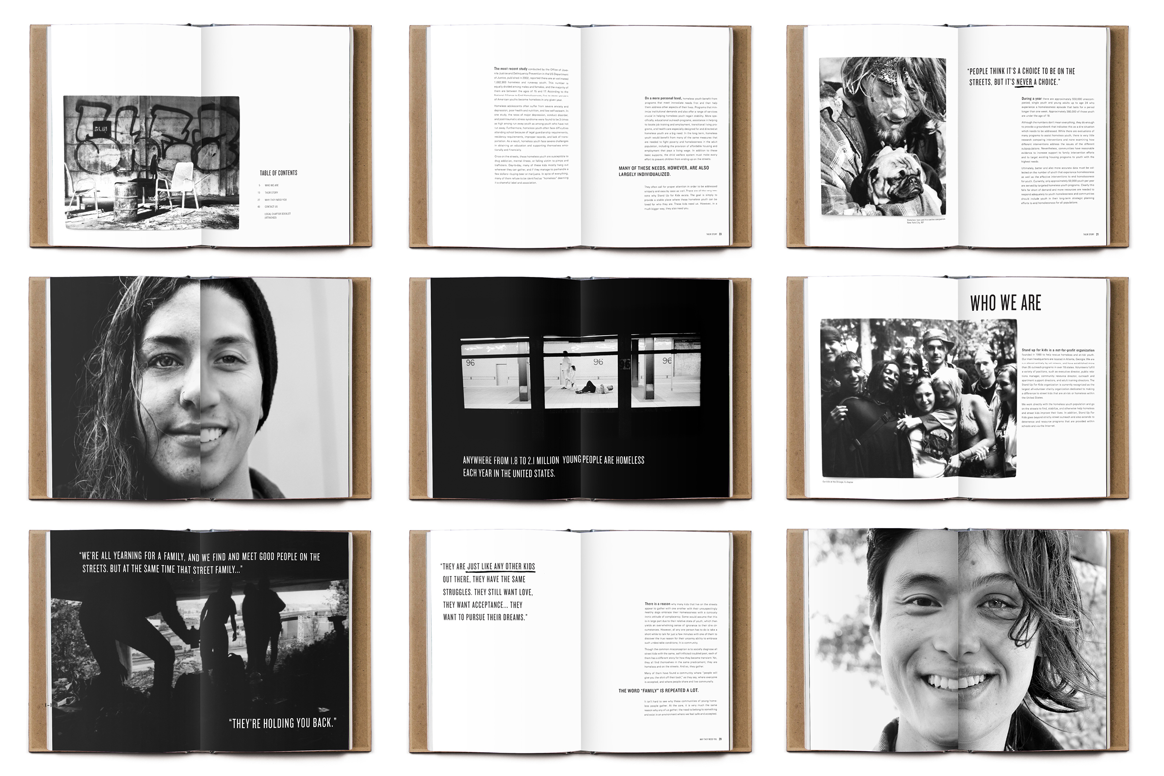
As a point to humanize the life and struggle of homeless and at-risk youth, design choices were made to reflect the overarching theme that “we all have dreams” despite our backgrounds and experiences. This central concept was delivered through a foldout feature within the book design. Each included a front-facing photograph of two different people that would then open from the center to reveal each of their dreams and passions. The idea was to provide an interactive juxtaposition of two people, who on the surface both have their own dreams, however one happens to be struggling with homelessness.
(=) design
Aesthetically, designs were carried out entirely in black, white, and gray. This was to offer an underlying symbolism in the irony of homelessness as a social issue, which many people treat as black and white when in reality there is much misunderstood gray area. Core materials used were cardboard, duct tape, and newsprint paper to support a vernacular that conveys a certain sense of grittiness and the constant need to collect salvaged items, and “make due with what you have.” A mentality that is often associated with homelessness and the city streets.


